

There are always web design software trends that don’t last long or remain only a brief beacon in the design sky. But there are also trends that are more than just hype. Our expert provides an overview of the 6 most important developments we should get used to.
Card Design

First popularized by Pinterest, card design has also established itself on various other content sites. The layout is particularly suitable for content-heavy websites. Web designers use card design to create a clear and intuitive interface.
With Card Design, content and information are offered via rectangular, visual cards that consist of a high-quality image section and a short description. Card Design is easily mobile adaptable for various end devices due to unlimited scaling down and up. Due to different image sizes, the user can be guided on the website in a structured way, important news is displayed in a correspondingly larger size.
For the creative arrangement of the maps, designers have the so-called grid system or the masonry layout to choose from. With the grid system, the width of the cards is already fixed. The Masonry layout is flexible in both width and height. Nowadays, many newspapers, such as the German magazine “Stern”, use this format to present articles online in a clear way and to highlight important, highly topical news. Free plugins like jQuery Masonry can be used to mimic this layout style for different heights and widths with animated cards.
Interactive loading screens
Loading screens and intros were often used in the past to preload large images. The user often had to wait, got bored and quickly clicked away. Loading screens were not a very popular web design software trend for a long time. Making loading screens an exciting and value-added design element has been a major challenge in recent years. Interactive Loading Screens offer an entertaining introduction to the website. The user is not bored, but provided with interesting information or entertainment elements. Presenting concrete and relevant content in the loading screen remains the order of the day.
Interactive loading screens can use hover effects that follow the user’s mouse movement. The aim is to hold the attention of the website visitor until the page is completely loaded. This is not achieved with boring screens but through interactive elements. The hover effects do not detract from performance and loading times. A successful use of graphics and sounds rounds off the user experience and offers a successful introduction to your web presence. For some sectors, mini-games are also an exciting way to entertain users and keep them “on their toes”.
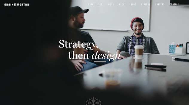
Hero video headers
A hero header is a full-screen display visual with visual, text and navigation elements. Hero headers have been a great way to make a great first impression for several years, especially in the B2C sector. And now things are moving: with the rise of video content on the web, hero video headers have also been spreading more and more for a few years now – and rightly so, as a best practice from the USA shows:

Scrollytelling
Scrollytelling is a successful mixture of storytelling and scrolling. The respective scroll speed controls the course of the story and is thus actively influenced by the viewer. The scrollytelling element usually consists of a single long microsite, i.e. a one-pager. This page usually does without any navigation elements, banners, sidebars or other disturbing elements. The user navigates exclusively by scrolling through the linear storyline. Texts, images, infographics and videos can be used as media elements and merge into a self-contained storyline in the one-pager. There is always a beginning and an end to the story. Both the concept and the storyline must be excellently elaborated in order to inspire the user. Scrollytelling is not yet very widespread for example in Germany, but this will change with increasing awareness and good best practices.

Combining typefaces

Even larger fonts and the use of different text fields are in vogue. What used to be considered a no-go is now considered an appealing style. Combining typefaces have proven to be a click-worthy design element in recent years. Creating great typeface combinations is an art, not a science. This usually involves combining sans serif with serif typefaces.
Material design
Google’s design language Material Design has been gaining momentum since 2016. The concept is not only used for Android apps, but also for more and more web applications. Large elements, contrasts in color, icons and fonts make up the design language. Do you recognize parallels to Flat Design? On the one hand, this is true, on the other hand, there is much more behind the design concept from Google.
Function is in the foreground of Material Design. The goal is to create a positive, user-friendly interaction between the user and the website or app. A simple, clear font and a fresh user interface – these are further elements of Material Design. These clear forms help the user to orientate himself and thus reduce the navigation path on a website or within an app.
Conclusion
Web design software, just like fashion, is always a phenomenon of its time. But just like in fashion, there are also timeless classics in web design.


No Comment