

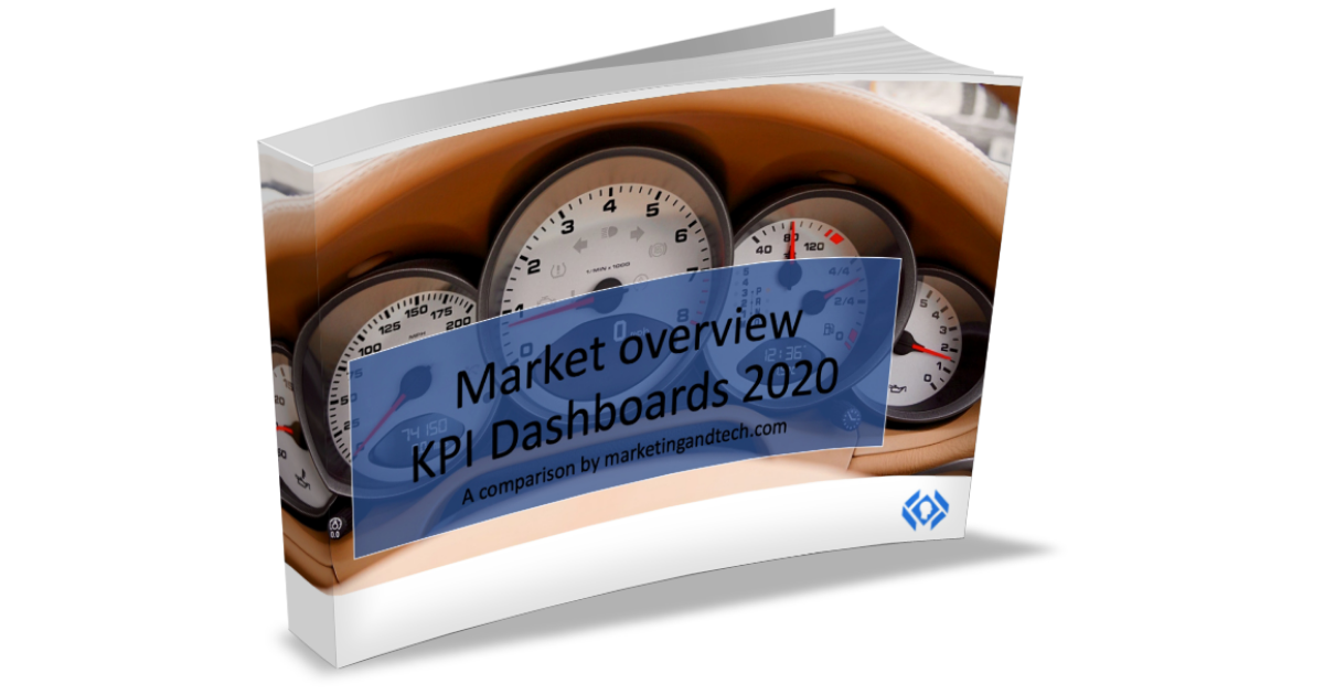
Companies generate a wide range of data in a variety of areas. KPI Dashboards help to aggregate this data, analyze it and make it usable. This allows departments to be managed efficiently, budgets to be allocated sensibly and developments to be identified at an early stage. We have compared 11 KPI Dashboards based on over 250 criteria. As always, a summary of the comparison is available for download.

By clicking on the download button you agree that your company e-mail address and your company name may be transmitted to marketingandtech.com (Digital Diamant GmbH) for advertising purposes, also by e-mail, and for market and opinion research. With your consent you will also automatically receive the marketingandtech.com newsletter. The declaration can be revoked at any time via a link in every e-mail.
Keeping an eye on key figures for successful corporate management
Today, hardly any company can do without a detailed analysis of its figures. However, this does not mean controlling the key financial figures. At least not only. Because successful companies use the possibilities to keep an eye on other data that are important for them. These figures can be gathered from the most wide-ranging areas of the company. This results in a multitude of data streams that initially – depending on the software stack – each stand on their own. Maintaining an overview is correspondingly time-consuming. In the past, the respective departments often helped themselves with their own constructions, which, despite all the advantages and diverse application possibilities of this tool, have clear disadvantages. Firstly, a relatively high setup effort, secondly, a high susceptibility to errors, and thirdly, limited visualization options. A classic case of “there must be an easier way to do this”.
KPI Dashboards provide an aggregated data overview
In fact, it can be better. Through KPI Dashboards that bundle data sources, relate them and merge them into an individual cockpit depending on the user. This enables a simple overview of the most important key figures, available at any time. As a result, you can effectively manage your own department, your own team, and ultimately the entire company. KPI Dashboards provide a high degree of transparency and enable the user to react quickly to current developments. The application possibilities are huge, wherever data is available or generated. Ultimately, KPIs can only be used effectively if they are also up-to-date and can be observed and related to each other. This is what KPI Dashboards do.
Anyone who collects key figures must also keep an eye on them, otherwise they are meaningless. KPI Dashboards are ideal helpers for the efficient control of departments and companies.
Frank Mühlenbeck, Publisher contentmanager.de
11 KPI Dashboard Tools in Comparison
We have defined over 250 criteria for our market overview, which should give you an orientation for your selection. Based on these criteria, we have compared 11 different tools with different focuses. Therefore, there can be no “winner” in our market overview. Rather, we want to help you get an overview and make a preliminary selection for your individual task. We have considered the following KPI Dashboards in the market overview:
Abis Cloud
Apteco Orbit
ClicData i4
DashboardFox
Executive Strategy Manager
Hootsuite Enterprise
Klipfolio
Knowi
Plecto
Whatagraph
Zoho Analytics
Allan Wille, founder and CEO of Klipfolio:

“While data expertise and access to data and analytics used to be left to data professionals, in the future forecasts, analyses and even recommendations will be made with the help of artificial intelligence and machine learning. And not just on the basis of their own data, but with the help of network data that improves the quality and informative value of analyses. Access to data and analytics – especially for non-technical decision makers – will become much easier in the future while at the same time the data expertise of all decision makers in companies will increase more and more.”
252 criteria in 11 categories
When designing the market overview, we drafted a catalog of questions that, in our view, presents the most important criteria for decision-makers when selecting an agency. The result is 252 criteria, which we have divided into 11 different categories. A special focus is understandably on the interfaces to various other software tools.
General information about the providers: Where are they based? How long has the company or product been on the market? How many customers are already using the product?
Industry specialization of the providers: We have compiled for you which tool is already being used successfully in which industry.
Language of the user interface: The purpose of Dashboards is the comprehensive consolidation of data – even across national borders. Therefore, it is important in which languages the user interface is played out. We have compiled this for you in the following overview.
Basic functions of the tools: How often is the data updated? Is it possible to set up a public Dashboard? Is there an app to monitor the dashboard alongside the web browser?
Analytics: Getting a view of just the numbers is only half the battle. What’s important is what conclusions you draw from it. That’s why analytics functions are elementary in tools. Does the software perhaps even make AI-based suggestions or give recommendations for action?
Visualization options: Data streams are bundled through KPI Dashboards. However, it is also important how the bundling can be visualized, because depending on the visualization, completely different conclusions can be drawn or developments can be identified correctly. We asked the software providers which visualizations are possible with their tools. The answers are very varying.
Typical purpose: There are no limits to the imagination where Dashboards can be used. The possibilities are too diverse. Nevertheless, there are typical scenarios that you can use to orient yourself as to whether the corresponding software is suitable for the intended use. We asked the manufacturers about typical uses of their tools.
Interfaces and integrations: The linchpin of a Dashboard, in addition to aggregation, is of course the data sources. Where does the data come from, what data can the software tap into and process. For this reason, we put a special focus on what interfaces and integrations exist with other software tools.
Data security and legal criteria: Where data is collected centrally and made available, the issue of data security plays a major role. We asked the software providers how they protect their customers’ corporate data. We also asked further legal questions about the GDPR and other issues. The answers are quite varied.
Additional services offered by providers: The project starts with the decision for a software. So that you can get a Dashboard up and running quickly and easily, it was also important for us to find out how the providers support you during the implementation and training phase, as well as during ongoing operation.
Pricing approach: The overview shows that software vendors have developed different cost models and price ranges, so it should be possible to identify a vendor in this category that fits your needs for every use case and set of requirements.

Who is behind the tools?
Abis Cloud
The Munich-based company employs ten people. The company does not provide any information about the number of its customers.
USP (according to the company): “Collaborative business cockpits implemented quickly and inexpensively. Individual connection of existing systems via connectors. Worldwide networking of teams and locations with personalized KPI Dashboards and integrated chat function. DSGVO-compliant with servers in Germany. Additional workflow and resource management system to dock with existing processes.”
References: E.ON Energie Deutschland, WirmachenDruck GmbH, Catena Media, MDR, Pro Sieben.
Apteco Orbit
The company Apteco from Frankfurt am Main has been on the market since 1987. 60 employees take care of the more than 500 customers who use the tool.
USP (according to their own statement): “With Apteco Orbit Dashboards you are always just one click away from your marketing target group. Dashboards give users an intuitive view of data. You can share insights with colleagues (even non-users) and generate audiences for your marketing campaigns directly from the visual components. This makes targeting and personalization a breeze.”
References: Brax, Detlev Louis, RTL interactive, Weltbild, Apollo
ClicData i4
French company ClicData has been serving its current 800 customers with its tool since 2015. 20 employees work at the Lille site.
USP (according to its own statement): “We are an all-in-one business intelligence platform. We offer 200+ connectors to business applications and databases; we have a built-in data warehouse to store and historize years of data. We also provide data manipulation features (data cleansing, fusion, merge, calculations, etc.) ClicData is a fully automated with custom data refreshes up to real-time updates. ClicData is also 100% cloud-based.”
References: Lexmark, Grand Frais, Intersport, Sharps Furniture, Tea Venture, Marsham Food Brokers, Vmware, ScaleX.ai, NaphCare
DashboardFox
Behind the tool DashboardFox is the company 5000fish from the USA. 10 employees work for the company, which has had its tool on the market since 2009.
USP (according to the company): “DashboardFox gives small to mid-sized businesses a modern BI platform without the burden of expensive subscription-based alternatives.”
Executive Strategy Manager
Also from the USA is Executive Strategy Manager from ESM Software. Around 125 customers are using the tool, which has been available since 2000.
USP (according to their own statement): “ESM’s Suite is made up of: ESM+Strategy to empower teams to formulate, track, implement and communicate a strategy using the Balanced Scorecard framework; ESM+OKR Objective Key Result methodology to tactically get strategic and operational work done; ESM+Perform to build and link employee goal plans to the strategy; ESM+Cyber to manage risk, compliance, ISO 27001, cyber security posture.”
References: Humana, Aetna/CVS, Mayo Clinic, NZ Defense Forces
Hootsuite Enterprise
Hootsuite is one of the two heavyweights in the market overview, with more than 1,000 employees. The company has focused heavily on social media management with its solution. In Germany, Hootsuite is headquartered in Hamburg.
USP (according to its own statement): “Hootsuite is the market leader in social media management and is trusted by more than 18 million users and employees worldwide, including 80 percent of Fortune 1,000 companies. With its unique expertise, comprehensive customer insights and collaborative ecosystem, Hootsuite helps people and businesses succeed on social media.”
References: eBay Classifieds, Johnson & Johnson, DKV Mobility, Bertelsmann Foundation, Searchmetrics
Klipfolio
The company by the same name as the tool comes from Canada, more precisely from Ottawa. 40 employees there continue to develop the software, which has been around since 2001.
USP (according to their own statement): “Klipfolio’s strengths lie in the customizability and flexibility of the Dashboards and reports. Klipfolio integrates with over 300 other solutions in real time. Sharing reports is easy and customizable. For agencies, Klipfolio offers a comprehensive customer management system.”
References: Red Cross, Elektolux, Sky, Walmart (jet.com), emma
Knowi
The Knowi company employs 20 people at its location in Califorien, USA. The tool has been on the market since 2015.
USP (according to the company): “Search-based analytics and integration with any data source.”
References: Lockheed Martin, Verizon, Scotiabank, Boku
Plecto
The Plecto tool comes from Denmark. The company of the same name employs 35 people and has been on the market since 2012.
USP (according to their own statement): “Visualizing real-time data on Dashboards. Instant notifications made to gamify and motivate staff. Real-time and automated shipping of reports. Friendly contests to motivate employees. Individual performance agreements for employees and managers”.
References: Pipedrive, Just Eat, Nestle, NETS, G4S, Verisure
Whatagraph
Whatagraph is a company based inAmsterdam. It has been on the market since 2017 and employs 41 people.
USP (according to its own statement): “One of the most visually advanced data reporting solutions for automated marketing reporting and monitoring.”
References: Fila, Fujifilm, Ogilvy, Colgate, Actimel
Zoho Analytics
Zoho Anlytics is a product of industry giant Zoho. The company, which has more than 8,000 employees, is headquartered in Austin, Texas in the USA. In Europe, it is based in Utrecht, the Netherlands.
USP (according to own statement): “Simple yet powerful BI self service solution”.
References: Certas Retail, Courier Logistics, Caffe Moak, Grupo Premo


No Comment