

Call-to-action buttons are lead drivers in marketing – if they are well chosen and correctly placed. Especially during peak season in e-commerce, call-to-action buttons in marketing can increase conversion rates. But choosing the best CTAs is a challenge and the freestyle of every marketing team. But what should you look for in call-to-action buttons? And what are successful call-to-action examples in marketing? You’ll learn all about it in this article.
The call-to-action (CTA) can be found on most websites. Be it for the download of a software, a whitepaper, software comparison or the contact to the company. However, you can also find a call-to-action in other advertising formats apart from the website. It is the means of choice on a landing page, in blog posts or in the newsletter to persuade customers to take action. However, for this to be successful and for a prospect to become a conversion – i.e. a customer -, a call-to-action must be very well placed and formulated. An experiment conducted in 2014 – and many others – examined what effective CTAs should look like in marketing. Of course, they can also be created relatively quickly. However, it’s worth investing a little more time in design, wording and placement to make a call-to-action as effective as it can be. We provide you with some tips for CTA buttons in marketing and a few successful call-to-action examples.
A call-to-action is still best implemented as a button, so that customers are most likely to click it. It is ideal on a website, landing page, blog or in the mail. In e-commerce, it is already the norm. Whether in ads or on the home page of an online store: A CTA button is clearly understandable and therefore already works fundamentally better than text links or images. When designing CTA buttons, you should keep the following in mind to ensure that they are well received by customers:
1. Text: Short and open
When formulating your CTA text for the button, you should always remember: None of your customers wants to be bossed around. A CTA should invite action, but not command it. In addition, it should be clear in the text what the clientele can expect after clicking. Try to build urgency or mention item scarcity in the CTA text. This subconsciously conveys to customers that clicking the CTA button is associated with added value. For example, getting a product before it is no longer available. In marketing, CTAs are also ideally suited for discount offers. Here, too, an urgency is created subconsciously. Especially during peak season, this is a conversion booster for e-commerce companies.
2. The right positioning
Basically, CTAs should be positioned in the navigation or at least prominently. But what does that mean? In the navigation, CTAs like the “contact us” are meant. This is usually the case on every website automatically through the “Contact” tab. In the page progression, companies should make sure to set strategic call-to-actions. For example, to draw attention to a particular offer or to simplify the search for visitors to the website. If users are to make a purchase, it is best to place the CTA button at the end of the page – or in any case following the description of a product or service. Extra tip: The size of the CTA button depends on mobile usability. Mobile-first applies! The button should be easy to click with the thumb. However, disruptive elements that are also clickable should not be placed near the CTA so as not to impair the visitor’s user experience.
When it comes to images, the key is to use them with caution. Faces that provide a line of sight around the CTA are well suited. The same applies to arrows. Less suitable, on the other hand, are very detailed or playful images. They distract too much from the call-to-action and thus inhibit effectiveness.
4. Set contrasts
The situation is different with well-placed contrasts. Much more important than the colors of a call-to-action button is the contrast on the website, landing page, etc. The button should be harmoniously integrated into the overall image of your website (or mail, newsletter, etc.) and still stand out clearly enough. Try different color versions and consider them the CTA button in the overall picture. Speaking of trial and error: This leads us to our last tip.
5. A/B testing for decision making
With A/B testing, you can try out different versions of your call-to-actions and measure the success of each. Because one and the same CTA button is not always suitable for all your channels to the same extent. So, for example, use different variants for website, blog and newsletter as well as different variants at different positions within a channel. Then compare the click-through rate for the CTAs on a channel. This will simplify the decision-making process.
Call to Action examples – successful CTAs
The following call-to-action examples give you an overview of good design. One thing in advance: especially large online stores, streaming services, well-known software providers and social media platforms have constantly revised their call-to-actions in recent years. They can be used as good examples.
Dropbox Business – Landingpage

On the Dropbox Business landing page, users are provided with simple information that makes them curious about the offering: “Store, share, collaborate and more with Dropbox.”. A screenshot gives a brief insight into the solution offered. The harmonious yet high-contrast blue CTA button invites users to try it out for free and shows them directly what to expect after clicking.
Netflix

Even with the streaming provider Netflix, users receive simple information about what is possible via the provider by registering. In short and concise sentences, the user is motivated to take action. The CTA button “Get started” is well highlighted, but still blends harmoniously into the start page. The images in the background are informative, appropriate to the theme and also not distracting due to the darkening.
Spotify
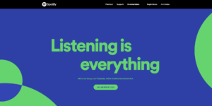
Steaming provider number two acts similarly to Netflix and refrains from using too much color. A catchy slogan and a few important pieces of information round out the CTA. The text in the CTA button, however, is a bit more direct than Netflix’s, but it still gives users the option to choose and it seems inviting but not commanding.

Instagram uses an image on the left side of the landing page for the call-to-action. The image shows the app and thus basically already provides the required information to users. The CTA to the right of the image is easy to understand and gives users an overview of the required data. In addition, users are given the choice between a regular registration and a simple version via their own Facebook account. The entire call-to-action on the landing page is kept discreet.

Pinterest designs its call-to-action on the landing page similar to Netflix. A darkened image in the background, a short information why users should register and the actual CTA field for the registration. The CTA button is kept like Instagram’s and is eye-catching due to the comparatively large registration field.
Conclusion
Of course, there is no such thing as the perfect call-to-action. Rather, a good CTA (including button) depends on the overall picture, the respective target group and the corporate design of the company. But for a CTA to be effective, it should:
- clearly structured,
- easy to understand and
- be attractively designed
Our tips already give you a good guideline on what to look for when designing the CTA (button). However, always remember to try out different CTAs using A/B testing when in doubt.


