

Various effects are attributed to colors. In marketing, they take on a special significance. The right choice of color is crucial. But how does the effect of colors in marketing turn out? We provide you with an overview on the topic of color psychology marketing and show you the different effects of colors. In addition, you will receive tips on what you should consider when choosing colors.
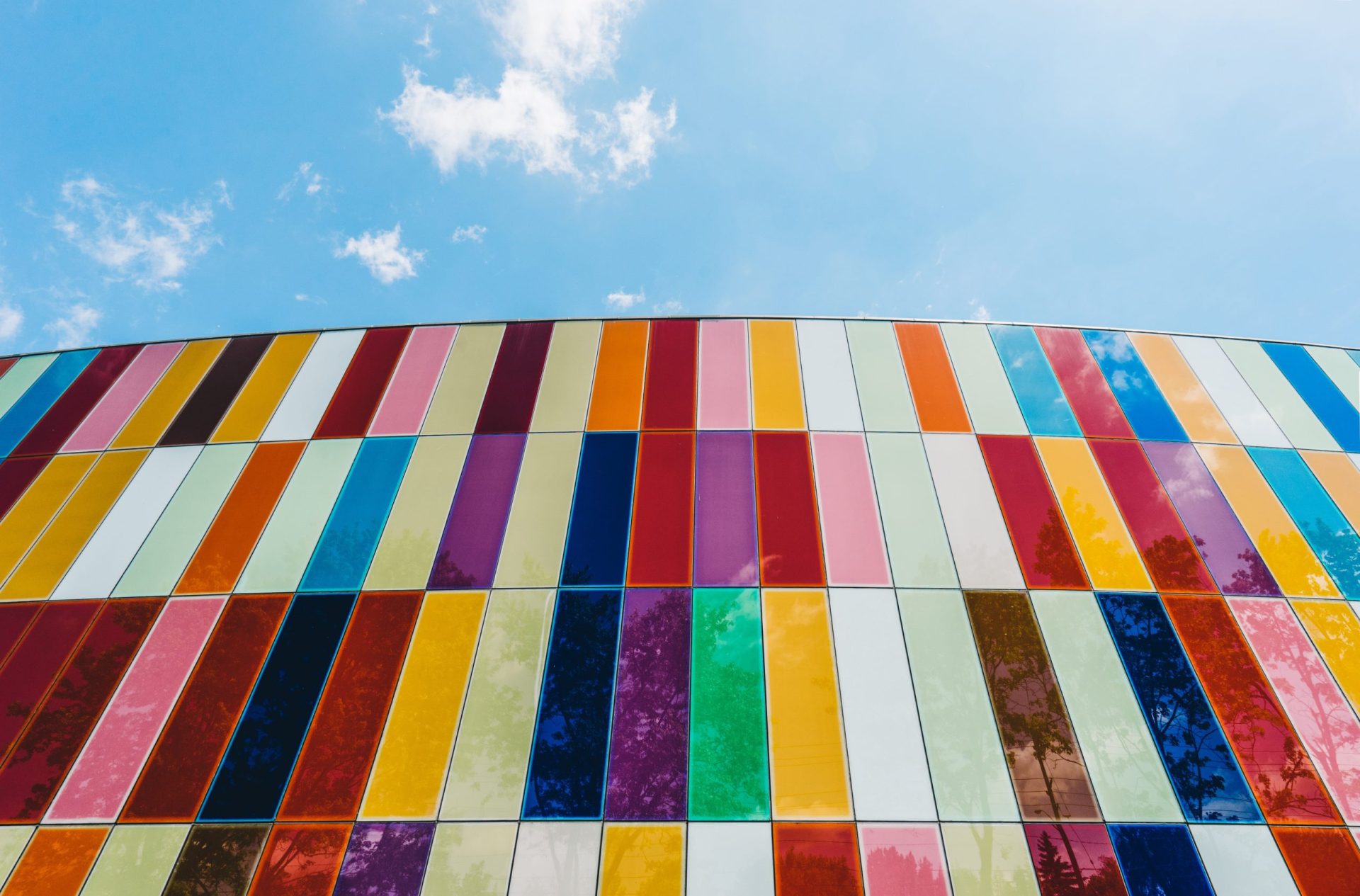
Red, blue, yellow, green – or all colors in between. Our world is colorful. And in marketing, much more. Colors have psychological effects and always have a different impact on people in different contexts. It’s not for nothing that color psychology is an important part of marketing. There are many studies that deal with the effect of colors. For example, an extensive one by MAYER DE GROOT Marketing Research and Consult, which was published in 2018. In their study (german language), Dr. Ralf Mayer de Groot, Dr. Psych. Reingard Kess and graduate psychologist Kai Stupperich examined the effect of colors in detail under the heading of color psychology marketing. Among other things, they looked at the influence of colors on customer perception and brand choice – for example, in logo design. In this area in particular, colors can play a significant role in the success or failure of a company or product. But how do colors work in marketing and advertising? What color effect do the primary colors red, blue and yellow have on customers? And what about other colors such as green, orange or violet? We show you the meaning of individual colors and explain their color effect.

It’s hard to imagine today’s communication without emojis. We have compiled a detailed emoji list for you and show you how to use emojis effectively in marketing.
Color symbolism – how colors are associated with properties.
In color psychology, scientists speak of color symbolism. It refers to the transfer of characteristics of colors to motifs and objects. A color appeals to the customer’s feelings. He associates certain characteristics with it and associates these with a product or a brand. The color association thus has a direct influence on our behavior through the feelings it generates. It creates expectations that a company should fulfill. For this reason, it is important for branders and companies to be aware of the effect of a color. Not every one is suitable for every purpose.
Color perception is subjective and culturally influenced
Color perception is subjective. There can therefore hardly be a truth set in stone in color symbolism. Sometimes perception is culturally influenced. One example: In Arab culture, the color red is associated with heat and the quality of “evil” as well as destruction. This is due to the fact that the heat of Arab countries makes the living conditions of the people there more difficult. In the cultural circle of rather colder countries like Russia, on the other hand, the color red has a positive meaning. Such different perceptions can be partially traced in the language of a population. In Russia, the word “krasnij” (red) belongs to the family of words to which the terms valuable, beautiful and splendid (krasiwij) also belong. A color usually has several associations, which can be contradictory. Marketeers should therefore take into account, among other things, cultural differences. Especially when it comes to a global marketing strategy. And: not everyone associates a color with the same effect as a marketeer might hope.

Color psychology of primary colors
The colors red, blue and yellow belong to the primary colors and are frequently encountered in marketing. After all, all other colors are based on them. An overview shows you how the three primary colors work in marketing and what pitfalls there can be.
Red – signal effect in marketing
Red is considered a difficult color. The effect is enormously contradictory. If in the Western context it basically stands for love, passion and energy, in marketing it has more of an alarming effect. In advertising, for example, red stands for discounts and is used as an accent to draw attention to certain items. Like most colors, it is multifaceted. In different gradations, it can therefore be associated differently. A wine red looks elegant and exclusive. Pink is playful and childlike. In marketing, this color is often used for female (young) target groups. A bright red stands out as a signal color in marketing, precisely because it stands for “attention” and “caution”. If you use the hue in marketing – no matter in which gradation – you should pay attention to the quantity so as not to appear aggressive. After all, you want to create pinpoint attention.
- Positive association: passion, love, warmth, energy, self-confidence
- Negative association: anger, danger, fire, war
- Gradations: dark red, wine red, pink etc.
- Effect in marketing: signal color, especially suitable for campaigns
- Important: use red in small quantities, so as not to exaggerate effects
Blue – seriousness in color
Blue is extremely popular in marketing. The color stands for credibility, reliability and security as well as professionalism, honesty and loyalty. Especially insurers and banks use blue. But blue is also a preferred color in the cosmetics and medical industries. This is because it is almost exclusively associated in a positive way. In the food industry, the (potentially) negative association “cold” is also turned into a positive one. For soft drinks, for example. Blue is used as a brand booster. Well thought-out color concepts are reflected throughout the company: in the brand logo, in individual campaigns, in graphics, in stationery and in office spaces. The color blue can also appear in various gradations: In addition to light blue, which has a calming effect, turquoise is popular in creative and progressive companies. A bright blue gives brands an energetic look.
- Positive association: credibility, reliability, professionalism, honesty, loyalty, calmness, refreshment, creativity, innovative spirit
- Negative association: coldness, sadness
- Gradations: light blue, turquoise, dark blue etc.
- Effect in marketing: conveys authority and stability as well as security, can stand for progressiveness and creativity
Yellow – dynamic and eye-catching
Yellow is the brightest of the primary colors and has an optimistic and dynamic effect. The rich tone provides energy and appears warmer the stronger the color turns out. The hue is perceived positively: It stands for freshness, liveliness and – think about gold – wealth. Similar to red, yellow has a signal effect in marketing and is often used as an accent for actions such as a call-to-action. The color is perceived quickly and has an effect over greater distances. For example, in a logo. It is best to surround the color with another color to enhance the effect of the yellow logo. The same applies to yellow: Use it in moderation! Not in masses. Otherwise, yellow can quickly appear cheap and obtrusive. Compromises can be the better choice, especially with the combination of red and yellow.
- Positive association: optimism, dynamism, warmth, freshness, liveliness, richness, cheerfulness
- Negative association: danger
- Gradations: pastel yellow, sunny yellow, gold, etc.
- Effect in marketing: signal color, especially suitable for promotions; also suitable for products that should be used with caution (e.g. certain tools)
- Important: use yellow just like red with caution, so as not to appear cheap or obtrusive
Color psychology marketing: secondary colors and tertiary colors
Secondary colors mix two primary colors, tertiary colors mix all three. In marketing, green is one of the most important secondary colors and has increased in popularity in recent years. Likewise, orange and violet are popular. But why is brown so unpopular in marketing? And what about the two special cases black and white?

Green – close to nature in marketing
Those who use green as a color in marketing rely on the effect of nature. The color is extremely positive and stands for naturalness, health, hope and happiness. It is very well suited to emotionally influence the attitude of your target group towards your company. Your company is associated with sustainability. Especially nowadays, the color is therefore found more often in marketing. The topic of environmental awareness has never been as present as it is now. In addition to its connection to nature, the color radiates tranquility and is pleasing to the eye. This depends on the shade: a very dark green has a calming and more serious aura than lighter shades of green. They look more lively, fresh and young. The facets of the color are particularly suitable for companies that want their brands to be natural and focus on what is healthy. For this reason, colors from the green spectrum are often found in the food industry or in the health sector.
- Positive association: environment/nature, happiness, hope, harmony, health, balance, renewal, relief, growth, tranquility, vibrancy, youth
- Gradations: dark green, light green, pastel green, etc.
- Effect in marketing: stands for environmental friendliness and sustainability; puts health in focus and is often used in the food industry as well as in health care
Orange – vitality and humor
In color psychology, orange has exclusively positive characteristics: vitality, friendliness and humor. It is an active color and is suitable for companies in the healthcare industry precisely because of its association with vitality. Since orange is mixed from red and yellow and is striking in tone, it is also one of the colors with a signal effect. Orange stands for affordability and is a compromise to the quickly aggressive looking red or to the yellow that likes to look cheaper. In advertising, orange is often used for children, as the color is associated with humor and playfulness.
- Positive association: vitality, friendliness, humor, affordability, youth
- Negative association: depending on color intensity danger
- Effect in marketing: weaker signal color than red and well suited as a compromise, often used in connection with children and beauty products (youth)
Violet – sensual and mysterious
Violet is also strongly associated with positive emotions. The colors of the violet spectrum stand for creativity, mysticism, spirituality and wealth as well as luxury. They appear mysterious and sensual. Therefore, violet tones are often used for beauty and wellness articles. Likewise, the color is often found in the creative industry or luxury companies. Violet is also used in companies where creativity is characterized by a spirit of innovation. A gradation of violet here is, for example, the Telekom magenta. Or think of the search engine Yahoo!
- Positive association: nobility, luxury, mysticism, prosperity (wealth), fantasy, spirituality, magic, creativity
- Negative association: intrigue
- Gradations: magenta, Lilac, etc.
- Effect in marketing: uniqueness, as the color is rarer in nature; often used for luxury goods
Brown – unpopular in marketing
Brown tones are hardly found in marketing. And this despite the fact that, from a color psychology point of view, brown stands for reliability, security and earthiness. Basically, you can express environmental awareness and naturalness with brown just as you can with green. The problem in marketing is that brown is quickly associated with dirt. Nevertheless, you should not disregard brown: In the meantime, companies have recognized the positive associations of the color for themselves. As a more discreet alternative to green, it can be found in advertising for coffee, wood or outdoor clothing. In other words, in all areas associated with nature and environmental awareness.
- Positive association: reliability, tradition, earthiness, naturalness, warmth
- Negative association: dirt
- Marketing effect: discreet alternative to green tones, which nevertheless emphasize naturalness; reliability and enjoyment are placed in the foreground (UPS as a delivery service, coffee as an indulgence)

Black – Modern and versatile
Black does not belong to the range of the visible color spectrum. By definition, black is the absence of light. And the color is ambivalent: nowadays it is perceived as modern, powerful, elegant and serious. But it can also seem threatening and oppressive, and traditionally stands for mourning, death and misfortune. In marketing, it nevertheless unfolds enormous potential in all its nuances. In corporate identity (CI), toned-down black is often used – especially in companies with a technical background. The reason: in today’s world, black is a sign of quality and luxury. Shades of gray also harmonize well with other colors and stand for professionalism and experience. Black appears particularly noble when the gray variant silver is used. Apple and Mercedes are among the best examples that skillfully use silver as a CI color.
- Positive association: luxury, elegance, seriousness, power, formality, mystery, strength
- Negative association: darkness, sadness, death, misfortune
- Gradations: shades of gray, silver as a highlight
- Effect in marketing: radiates modernity, appears noble and is suitable for innovative brands and products
White – particularly positive effect
White traditionally stands for purity and innocence. For peace and health. Negative associations such as colorlessness, coldness and emptiness are reversed with white in marketing. Thus, the color is often used to support the refreshing character of a cool drink. Instead of “unimaginativeness,” the color white is ascribed simplicity. This characteristic is often used in areas that are normally considered highly complex. For example, in IT. Here, white highlights companies that offer simple solutions for customers. The colorlessness is also translated into purity. Think of the wedding industry or detergent brands like White Giant.
- Positive association: purity, cleanliness, simplicity, youth, honor, peace, innocence, health
- Negative association: coldness, colorlessness, unimaginativeness, emptiness
- Marketing effect: refreshes, reduces complexity, emphasizes various product characteristics such as purity in detergents

Content marketing is an important building block in the marketing mix. Unique content is now a must-have for companies. Want to learn more about the content marketing process? Then read our article about the content marketing phases.
Effect of colors: tips for choosing the right colors
Color should not be left to chance – this is the most important tip. For example, compile important aspects of your communication or features of your product. Based on this list, you can specifically address the color symbolism and weigh which colors correspond best with the listed features. The same is true, of course, for brands you want to reestablish. Knowing what sets your brand apart will help you better narrow down your color choices.
Beyond the pure brand and product characteristics, you should of course equally keep the target audience in mind. Example: your new product stands for sustainability and should be emphasized accordingly. The color world offers green and brown tones. However, your target group tends to be young. In this case, a fresh, lighter green would be suitable, which, in addition to naturalness, also stands for liveliness and youth.
If you are operating internationally, you should also take cultural factors into account if your target group has a different cultural background. But keep in mind: even if you take many aspects into account when choosing your colors, you will not be able to reach every person in your target group. Color impact is always subjective in the end.


No Comment